Gray is the New 'Coming Soon'
by @digital.black · · 0 0
If it's black and white, it's a placeholder. If it has color, it actually works. Welcome to Loytz's silent film era.
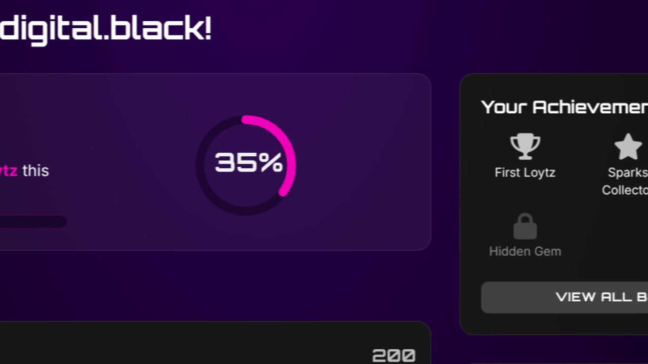
Quick UI philosophy lesson while I'm knee-deep in development: see something gray? Don't click it. It's decorative.
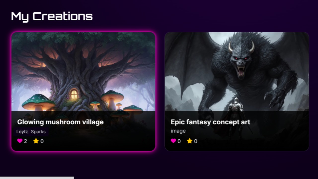
I could've gone with the classic 'Coming Soon!' badges or those annoying tooltips that say 'This feature will be available later.' Instead, I chose the path of visual honesty. Grayscale = not ready. Color = functional (almost:). Simple.
Think of it as Loytz's silent film phase. We're currently living in a black-and-white world, but every feature I finish gets its color back. It's oddly satisfying watching the platform slowly transition from noir to HD.
Right now, about 80% of what you see is grayscale. Which sounds bad until you realize it means 20% actually works, and that's more than I expected at this stage.
So if you're clicking around and wondering why nothing happens – that's not a bug, that's a feature. A feature-that's-not-actually-a-feature-yet.
The goal? Full technicolor by launch. Or at least enough color that it doesn't look like I'm building a minimalist art project.
Stay tuned for the great colorization of 2025.


